


CQ Medical
UX Strategy | UX Design | Website Development | Accessibility
CQ Medical is the global leader in patient radiotherapy positioning and healthcare innovations that advance human care.
The Situation
CQ Medical was born from the merger of two legacy medical device brands, each with its own extensive product catalog and a combined 80 years of experience. This merger posed a significant challenge in how to consolidate and present distinct product databases with separate, but overlapping, language and taxonomy. The merger also led to a new visual brand identity, which was central to CQ Medical's future online presence.
The Solution
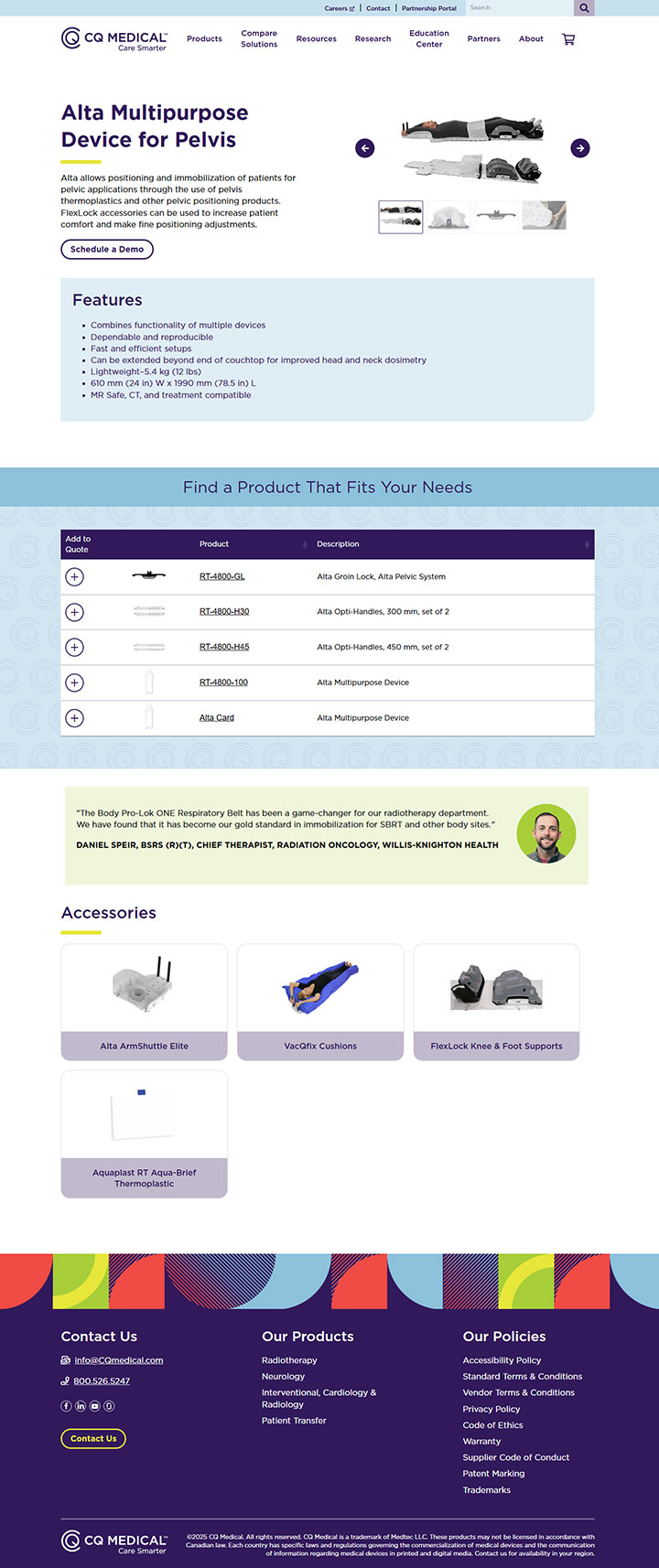
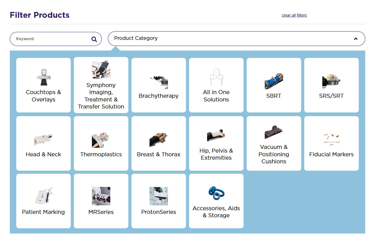
Northwoods set out to solve this challenge through development of a UX strategy as a first step. Throughout the process, Northwoods experts worked closely with CQ Medical to establish a new taxonomy and schema that merged the two catalogs, ensuring that product categories, specifications, and relationships were clear, intuitive, and scalable.
We then incorporated CQ Medical’s new brand standards into the website design and created an intuitive user experience that emphasizes clarity, simplified navigation, and inclusivity. From early prototypes through development, Northwoods followed accessibility best practices and thoroughly tested both code and content to ensure WCAG 2.2 Level AA compliance at launch.
On the back end, our developers prioritized efficiency, enabling the CQ Medical team to quickly and easily make updates to product pages using Titan CMS, an enterprise content management system powered by Northwoods.
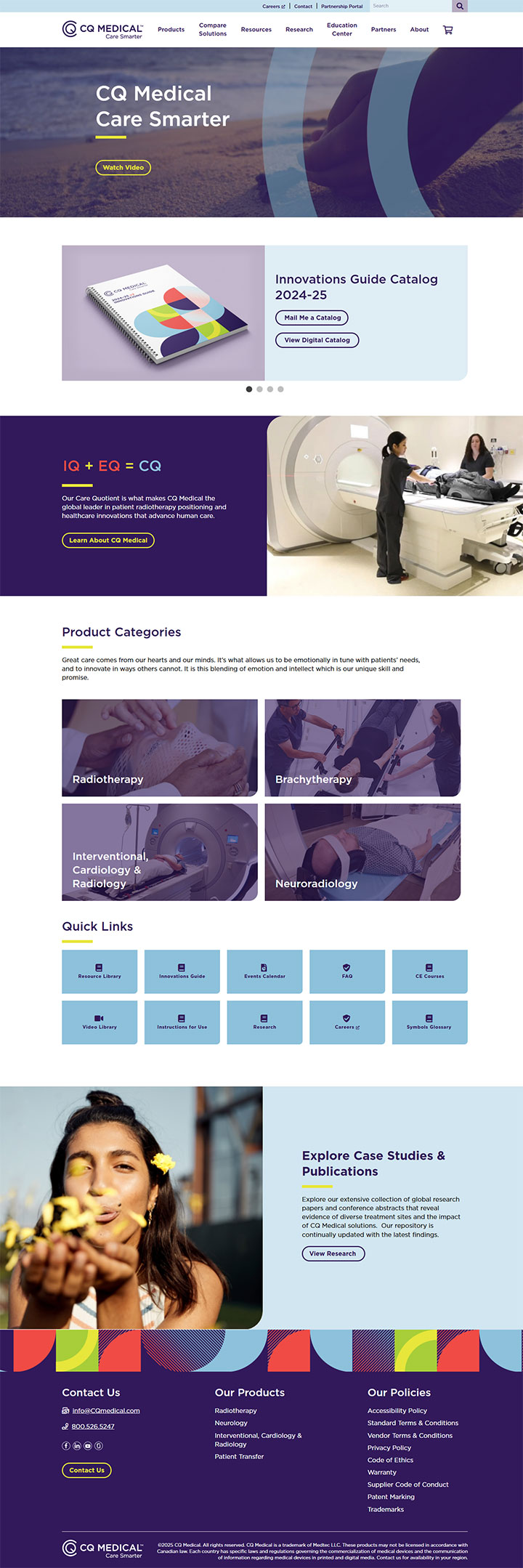
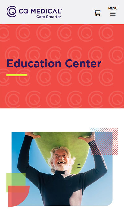
Mobile-Friendly Design
The CQ Medical website has a significant amount of content that needed to stack seamlessly on mobile, without feeling cluttered or overwhelming. Our challenge was to create a smooth, responsive layout while maintaining the integrity of the brand’s visual identity. Every design decision balanced usability with aesthetics, ensuring that the mobile experience feels just as polished and engaging as the desktop version.
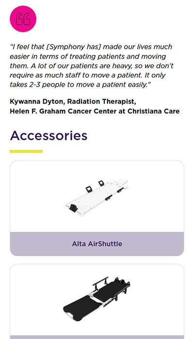
While prioritizing mobile-friendly responsiveness, we also preserved the brand’s signature pops of color and bold visual elements. This helped keep the design dynamic and striking, preventing the site from feeling too text-heavy despite the large amount of content.
Overall Design Approach
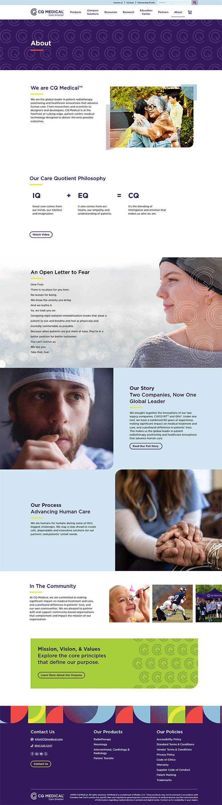
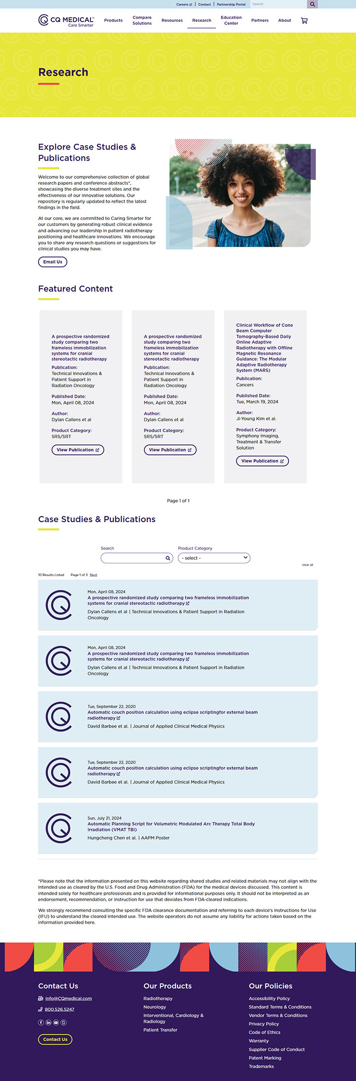
The website design needed to align seamlessly with CQ Medical's new brand identity, which embraces a bold and energetic aesthetic. This includes vibrant colors, playful imagery, and a distinctive use of the company's logo bug to reinforce brand recognition throughout the site. Every design element was carefully considered to reflect the updated visual language, ensuring a cohesive and engaging user experience.
To enhance usability, we designed a dynamic and visually rich menu that prominently features product imagery, making it easier for users to navigate and quickly find what they need. By incorporating clear, intuitive categorization and high-quality visuals, the menu not only improved functionality but also reinforces the brand’s personality.
The Outcome
The new website seamlessly combines CQ Medical’s two previously separate companies under a single, unified digital roof, laying a strong foundation for the company’s continued growth.