
Powerbrace
Content | UX Design
Since 1960, Powerbrace has been designing and delivering the highest quality door securement products available for truck trailers, specialty trailers, truck bodies, and intermodal transport. Their team of experts offers the personal guidance and dedicated support required to determine the best solutions for each customer’s unique needs.
Northwoods Overhauls the User Experience for Manufacturer’s Outdated Website
Powerbrace first came to Northwoods looking to redesign their outdated website, though it quickly became clear that they were in need of a new brand strategy to help guide that process. They put their trust in us as their digital BFFs to develop a brand strategy and create a new brand identity to leverage their strengths and help them more effectively compete in the marketplace. Northwoods’ UX, design and SEO experts used the updated brand identity as a foundation to create a modern, user-friendly website that would better serve Powerbrace and its customers and position the company for long-term success.
The Situation
The previous Powerbrace website used outdated colors, typography, content, and images, and needed a design refresh.
Data showed clear signs that the site was difficult to navigate and that users were struggling to find the content they needed.
A confusing online product catalog lacked dynamic detail pages and product-related resources.
Due to a complicated setup, poor training, and lack of support from a previous vendor, the Powerbrace team wasn’t able to make necessary changes or content updates.

Homepage Design
Authentic imagery, a sense of movement, and the use of video work together to highlight real-world applications of Powerbrace products and the dedicated teams behind them. The end result underscores the Powerbrace tagline, “Securing Your Satisfaction for The Road Ahead.”
Northwoods designers created a custom blueprint background pattern that serves as a shout-out to the hard work of Powerbrace engineers, an important team that was underrepresented on the previous website. The blueprint is based on an actual product drawing provided by the client, with updated brand colors, grid pattern, and gradients applied to create a visually cohesive and professional design.

The Solution
Informed by the new brand strategy, our UX team developed a website strategy that drives visitors to key pages and clarifies CTAs, streamlining the navigation and offering a more intuitive experience.
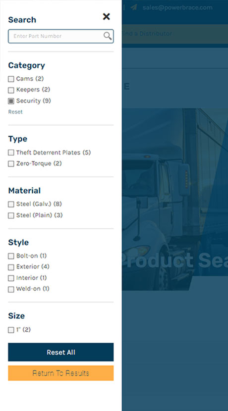
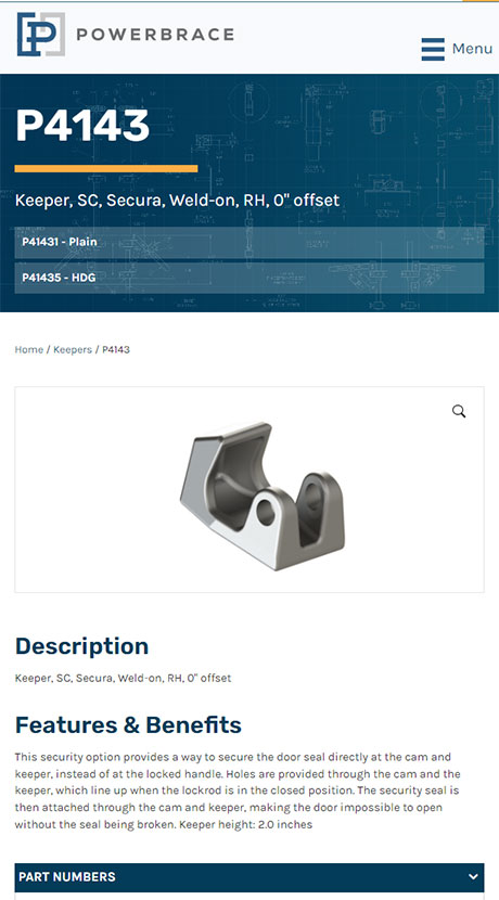
We created new search and filtering capabilities so users could quickly find specific products and detail pages that include features, helpful resources, and related components.
Northwoods developed copy that was relevant, on-brand, and optimized for SEO, and handled the migration of existing content, ensuring a smooth transition and launch for the Powerbrace team.
Resource Library
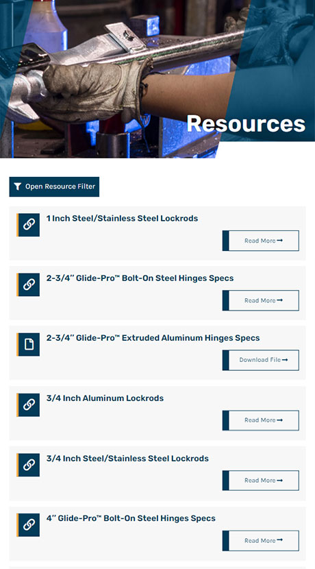
Northwoods designers added mobile-friendly filtering to the Powerbrace product search and resource pages, so users can easily find what they’re looking for. To enable filtering, our team developed a schema, turning free form content into structured data. We also tagged the data so it could be filtered, and to show related products on product detail pages. The comprehensive resource library allows users to visit a new page for more information, download a file, or use a modal pop-up to watch a video. Each of these actions is clearly defined within the button text, creating a well-defined, consistent experience.

We put our trust in the Northwoods team to create a digital presence that’s visually compelling, effective, and true to our brand, and they delivered. Our new site is easy to manage and provides a great user experience for both current and prospective customers. Northwoods offered honest, expert guidance throughout the redesign and has truly been our digital best friend.
- Jodi Rummelhart, Director of Business Development
Overall Website Design
Bold colors reinforce the Powerbrace brand position and personality, with dark blue used to indicate stability, knowledge, and integrity. Accent colors include a lighter blue to convey trust, loyalty, and confidence, and yellow for a sense of sincerity and warmth. Geometric shapes, grids, and angles add interest and texture, make the site feel cohesive, and strengthen the brand.
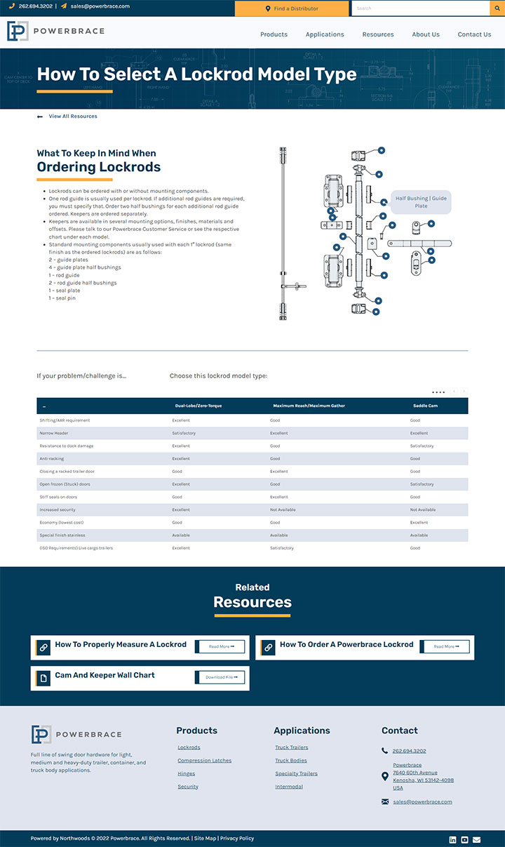
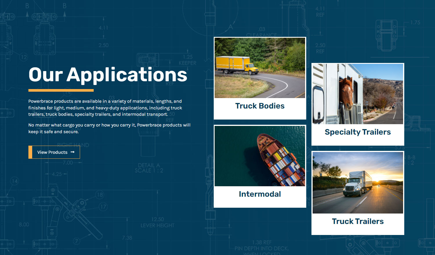
The design features photos of Powerbrace products in action, a key area of focus drawn from the website strategy. Images used throughout the site include members of the Powerbrace team, showcasing the manufacturer’s processes and the individuals behind the work. Rather than relying on stock photography, professional photos and video taken by Powerbrace were used to help the brand feel authentic.
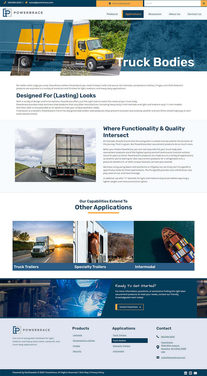
Interior page banner images are a lot of fun and add a unique design element. Angled shapes and brand color overlays are used to create a strong focal point and balance the natural colors of each image with the Powerbrace brand palette.
The Outcome
Powerbrace now has a fresh, modern, and beautifully designed website with a streamlined user experience.
Content developed for SEO matches different portions of the customer journey and helps improve Powerbrace’s search rankings.
A dynamic and searchable product catalog can be filtered by category, type, material, or style, allowing users to quickly find the parts they need.
The Powerbrace team is thrilled with the look and feel of the site, as well as their ability to easily make adjustments and updates.
Learn more about the brand strategy that guided the website redesign.


